

Understanding Color Theory
Color theory is a foundational concept that helps individuals comprehend how colors interact and the impact they can have on mood, perception, and spatial experiences within a home. At its core, color theory is built upon three primary colors: red, blue, and yellow. These colors cannot be created by mixing other hues and serve as the building blocks for all other colors. From these primary colors, we derive secondary colors, which are formed by mixing two primary colors. For instance, combining red and blue yields violet, while blue and yellow produce green, and red with yellow results in orange. Tertiary colors come into the picture when a primary color is mixed with a secondary color, such as red-orange or blue-green, expanding the palette available for home decor choices.
The arrangement and interaction of these colors are significant when selecting a color palette for your home. For instance, warm colors like reds, oranges, and yellows tend to evoke feelings of warmth and intimacy, making them suitable for spaces intended for social gatherings, such as living rooms and dining areas. In contrast, cool colors, which include blues, greens, and purples, often impart a sense of tranquility and calmness, making them ideal for bedrooms and bathrooms, where relaxation is key.
Moreover, the way colors are combined can affect the perception of space. Lighter colors can make a room feel larger and more open, while darker shades can provide a cozy and intimate atmosphere but may also make a small space feel even smaller. Understanding these principles of color theory can vastly improve your choice of color palette, ultimately creating a harmonious environment that resonates with personal style and functional needs.
The Psychology of Colors
Colors play a crucial role in influencing human emotions and behaviors, which is why selecting the right color palette for your home is essential. The psychological impact of colors can evoke various feelings, and understanding these relations can help you create spaces that align with your desired atmosphere. For instance, blues and greens are often associated with calmness and tranquility. These hues mimic natural scenes, promoting relaxation and reducing stress levels, making them ideal for bedrooms and living areas where serenity is desired.
On the other hand, warm colors such as reds, oranges, and yellows can stimulate energy and enthusiasm. These colors are often used in kitchens or gathering spaces, encouraging social interaction and creativity. Yellow, in particular, brings a sense of cheerfulness and optimism, making it a popular choice for spaces that require a lively touch. However, it is important to balance such vibrant colors with more subdued tones to prevent overwhelming the senses.
Neutral colors like whites, grays, and beiges also play a significant role in home decor. They serve as a versatile backdrop that allows for experimentation with bolder accents while fostering a sense of spaciousness and cleanliness. The use of earthy tones can create a warm and inviting environment, promoting comfort and grounding. Furthermore, the choice of color can affect individuals differently based on cultural associations and personal experiences, making it vital to consider your own preferences along with general psychological insights.
Ultimately, the colors you select for your living environment should reflect your personality and lifestyle while serving the intended purpose of the space. By understanding the psychological effects of various colors, you can make informed decisions that enhance your home’s atmosphere and cater to your emotional well-being.
Assessing Your Space
Choosing the right color palette for your home begins with a thorough assessment of the space in question. It is essential to consider several factors, including lighting, size, and architectural style, as these can significantly influence your color selection.
Lighting plays a crucial role in how colors appear within a room. Natural light can change the perception of color throughout the day; for instance, a shade that seems warm and inviting in sunlight may look cooler under artificial lighting in the evening. Therefore, observe how your space is illuminated at different times and adjust your palette accordingly. Consider using color samples to see how they interact with your lighting conditions before making a final decision.
The size of the room also affects color choice. Lighter colors tend to make a small space feel larger and airier, while darker shades can create a cozy and intimate atmosphere. If you are working with a limited area, it may be beneficial to select a color scheme that incorporates soft hues, which help to visually expand the dimensions of the room. Conversely, larger spaces can comfortably accommodate bolder shades, allowing for a more dramatic look without feeling cramped.
Architectural style is another key element to consider when assessing your home. Different styles, from contemporary to traditional, may call for distinct color palettes that highlight their features. For example, a modern farmhouse may benefit from a rustic palette with soft neutrals and earth tones, whereas a sleek modern space might look best with a monochrome scheme. Ultimately, your home’s architectural characteristics should harmonize with your chosen colors to create a cohesive and inviting environment.
Creating a Color Story
Developing a cohesive color story for your home is essential in reflecting your personal style while also creating an inviting environment. A well-curated color palette serves as the foundation for the overall aesthetic of a space, thereby enhancing its character and harmony. To begin this process, it is crucial to identify your preferred colors. This can be influenced by various factors, including existing furniture, artwork, and even the emotions associated with specific shades.
When crafting your color story, consider a balanced approach that combines both neutral tones and accent colors. Neutral colors, such as whites, grays, and beiges, serve as a versatile backdrop that can help to make spaces feel larger and more cohesive. These hues provide a serene canvas that allows for artistic expression through the addition of accent colors. Accent colors are bolder and can infuse life into the space, enabling you to incorporate elements of your personality and preferences.
Moreover, it is advisable to choose a limited number of accent colors—generally two to three—to prevent visual clutter. This limited palette allows for stronger visual relationships between items, whether they are in furniture, wall art, or home accessories. Additionally, consider how different colors interact under varying light conditions, as this can significantly influence your color choices. Natural light, as well as artificial light, can alter perceptions of color, making some shades appear more vibrant or muted.
In the process of creating a color story, experimentation is key. Utilize paint samples or swatches to visualize how different combinations will coexist in your space. By thoughtfully balancing neutrals with accent colors, you can ultimately achieve a harmonious environment that not only reflects your personal style but also invites warmth and comfort into your home.
Using Color Swatches Effectively
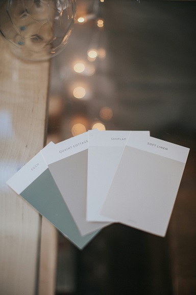
Selecting the right color palette for your home begins with an effective use of paint swatches. Paint swatches are your guiding tools, providing a preliminary glimpse of how colors may appear when applied to your walls. To maximize their utility, it is essential to start by obtaining a variety of swatches that resonate with your vision for the space. Many paint stores offer sample swatches that can be taken home for further evaluation.
One effective strategy is to compare the color swatches against the existing furnishings in your home. This allows for a better visual assessment of how the new color might interact with your furniture, floors, and other decor elements. Consider laying out the swatches directly beside or even on your furniture to gain a holistic view of potential conflicts or synergies.
Another important aspect to consider is lighting. Colors can change dramatically depending on the type of light under which they are viewed. Natural light, for instance, has a different effect compared to incandescent or fluorescent lighting. Hence, it is advisable to test color swatches in various lighting conditions. Place them in different locations around the room, especially where natural light enters, to observe how they evolve throughout the day. This practice will help you understand how your chosen colors will appear both in daylight and during the evening when artificial lighting takes precedence.
Finally, while it can be tempting to make a quick decision based on a swatch that initially catches your eye, allowing time for reflection can be beneficial. Observe the colors over a few days in varying conditions, as this can provide deeper insights into their mood and suitability for your home environment.
Incorporating Trends with Timelessness
When it comes to decorating a home, understanding the interplay between current trends and timeless shades can greatly enhance your living space. Color trends in home décor evolve with society, influenced by fashion, technology, and even global events. For example, earthy tones have surged in popularity, reflecting a collective desire for nature and sustainability. Shades like terracotta, olive green, and warm beige are embraced for their soothing qualities and versatility.
However, the key to achieving a balanced look lies in blending these trendy hues with established classic colors. Timeless colors such as navy blue, deep gray, and crisp white serve as the sturdy foundation of your home’s color palette. These shades not only provide contrast but also maintain longevity, making your interiors adaptable over time.
To successfully incorporate trendy colors into your home, consider using them as accents rather than dominant elements. For instance, if you choose a popular earthy tone for a feature wall, complement it with classic white trim and classic furniture in neutral hues. This approach creates visual harmony and ensures that the overall aesthetic does not feel dated as trends change.
Moreover, integrating key accessories—like cushions, rugs, or artwork—reflecting current trends can be a smart strategy. This method allows you to refresh your space periodically without overhauling your entire color scheme. For example, pairing vibrant, trendy cushions with a classic gray sofa provides a modern touch while remaining anchored in timelessness.
Ultimately, striking a balance between trendy and timeless in your home décor promotes a sophisticated yet inviting atmosphere. It allows you to express your style while ensuring the longevity of your design choices, catering to evolving tastes and preferences.
Practical Color Palette Tools
Choosing an effective color palette for your home can be significantly simplified with the use of various tools and resources available today. Whether you are a seasoned interior designer or a homeowner embarking on your first redecorating project, these resources can guide you through the decision-making process.
One valuable resource is online color palette generators. Websites like Coolors and Adobe Color allow users to explore thousands of color combinations. These platforms often provide options to adjust hues, saturation, and brightness, ensuring the selected palette harmonizes perfectly within your space. By experimenting with these tools, you can easily visualize how different colors work together, making it simpler to arrive at an ideal choice.
In addition to online tools, mobile applications have gained popularity in assisting homeowners with color choices. Apps such as ColorSnap by Sherwin-Williams or Behr’s ColorSmart offer features that enable users to capture the colors in their environment and suggest complementary shades. This mobile accessibility makes it easy to undertake color sampling whenever inspiration strikes, ensuring that your chosen palette is both timely and relevant.
Design books and magazines also serve as excellent resources. They typically showcase coordinated color palettes used in actual interior settings. By examining these visual examples, you can gain insights into depth, contrast, and the emotional responses different colors evoke. Look for books specifically focusing on color theory, as they dissect how colors interact and can influence the ambiance of a space.
Utilizing a combination of online tools, mobile apps, and design literature can enhance your knowledge and confidence in selecting a color palette that reflects your personal style and enriches your home environment. Each resource adds a unique perspective, making the journey to perfecting your home’s colors more approachable and enjoyable.
Tips for Choosing Colors in Different Rooms
When selecting a color palette for your home, it’s essential to consider the function and mood of each room. The right color choices can significantly enhance the atmosphere, reflecting not only personal style but also meeting the unique needs of each space.
Living Room: This area serves as the heart of the home, where families gather and entertain guests. Warm neutrals or earthy tones can create a welcoming ambiance. Soft greys or pastels can also lend a modern feel while keeping the room open and airy. To add vibrancy, consider accent walls in deeper shades such as navy blue or forest green. These colors not only serve as a stunning backdrop for artwork but also encourage conversation.
Bedrooms: In personal sanctuaries, your choice of color is crucial for promoting relaxation and rest. Soft color palettes featuring pale blues, gentle greens, or calming lavenders can contribute to a soothing atmosphere. For added depth, consider using darker shades for an accent wall, perhaps a deep plum or serene teal, which can create a cozy retreat, perfect for winding down at the end of the day.
Kitchens: Kitchens benefit from colors that inspire energy and creativity. Bright, cheerful colors such as sunny yellows or crisp whites can make the space feel inviting and clean. If you prefer a more modern approach, consider deep grays or navy coupled with warm wood accents, which can provide a sophisticated contrast while maintaining functionality.
Bathrooms: Since bathrooms serve as personal sanctuaries, colors that evoke cleanliness and relaxation are ideal. Soft whites, light aquas, or muted grays can give the room a spa-like feel. For personality, a touch of vibrant color like coral or seafoam green in accessories can bring warmth without overwhelming the space.
Finalizing Your Color Palette
Choosing the right color palette for your home can be a transformative process, but finalizing that palette requires careful consideration and actionable steps. To begin with, consulting with professionals such as interior designers can provide invaluable insights. These experts can help you understand the color theory and how various hues interact with each other, ensuring that your selections harmonize throughout the space.
Once you have established some initial preferences, the next step is to obtain samples. Many paint stores offer sample pots that allow you to test colors on your walls. This is a crucial practice, as lighting and surrounding furniture can greatly alter the perception of a color. Apply samples on large areas of the wall and observe how they look at different times of day. This will enable you to see the true colors in your home’s natural and artificial light.
Another effective method for finalizing your color palette involves visualizing the complete look of your space. You can utilize digital tools and apps designed for interior design that allow you to piece together furniture and decor elements alongside your chosen colors. Alternatively, mood boards made from swatches and images can help you visualize how each component interacts and creates an overall aesthetic.
In your final stages, consider how the broader palette ties together each room and flows from one space to another. A cohesive color scheme enhances the feeling of unity in your home. Therefore, invest time in refining your choices until you feel confident that your palette reflects your personal style while creating the intended ambiance. By following these steps, you can effectively finalize a color palette that not only beautifies your home but also remains functional and vibrant over time.