

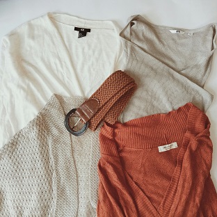
Understanding Neutral Colors
Neutral colors are a range of shades that do not typically appear on the color wheel but serve as essential foundational elements within fashion and interior design. These colors play a pivotal role, allowing other hues to stand out while providing a subtle, sophisticated backdrop. Common neutral shades include whites, blacks, grays, beiges, and browns, each offering a unique quality that varies with their respective undertones. Whites can range from crisp, clean shades to warmer, creamier tones, influencing the overall atmosphere of a space or outfit. On the other hand, blacks provide depth and elegance, often evoking a sense of authority and timelessness. Grays serve as a versatile bridge between the two extremes, allowing for a multitude of combinations with other colors. Similarly, beiges and browns introduce warmth and earthiness, grounding designs and style choices.
The versatility of neutral colors extends far beyond simple combinations. They can beautifully harmonize with bold prints and vibrant colors, making them indispensable in both wardrobes and décor. A neutral palette encourages creativity, enabling individuals to layer textures and patterns without overwhelming visual appeal. Additionally, the timeless nature of neutrals makes them a lasting choice; they are less likely to go out of style, serving as a reliable base for any design or fashion statement.
In essence, neutral colors are integral in establishing a cohesive and harmonious aesthetic. They act as a unifying element, allowing for personal expression while maintaining a refined elegance that can easily adapt over time. With the appropriate understanding and application of these shades, one can elevate their style and create impactful looks or spaces, underscoring the importance of mastering neutrals.
Choosing the Right Neutrals for Your Skin Tone
Selecting the appropriate neutral colors for your wardrobe begins with understanding your skin tone, which can be categorized into three main undertones: warm, cool, and neutral. Each category offers a distinctive palette that complements natural hues, enhancing your overall appearance.
To determine your skin’s undertone, observe the subtle hints that reveal your natural coloring. For warm undertones, which typically exhibit a yellow or golden hue, iconic colors include beige, camel, and warm taupe. Individuals with warm skin tones tend to look radiant in warm neutrals, as they enhance their complexion and exude a natural glow.
In contrast, cool undertones are characterized by pink, red, or blue hues. Those with this skin tone often find that cooler neutral shades, such as gray, charcoal, and crisp white, bring out the best in their features. Wearing these colors can create a sophisticated look, harmonizing with the natural coolness of the skin.
Neutral undertones sit at the intersection, blending both warm and cool elements. People with neutral skin tones can enjoy the best of both worlds, often finding that a wider selection of neutral shades like taupe, ivory, or stone complements their look. This flexibility allows individuals with neutral undertones to experiment with various colors without clashing.
Determining your skin tone can also be achieved through simple tests, such as checking the color of your veins or how various jewelry tones complement you. Gold typically flatters warm undertones, while silver enhances cool tones. Through understanding these fundamental principles of skin undertones, you can confidently choose neutrals that will elevate your style, ultimately leading to a polished and professional appearance.
Mixing and Matching Neutrals
Mastering the art of mixing and matching neutral colors is essential for creating a sophisticated and harmonious ensemble. Neutral tones encompass a wide spectrum, ranging from soft beiges and creamy whites to rich charcoals and deep browns. An effective approach to styling these colors lies in balancing light and dark shades. For instance, pairing a light beige top with darker taupe pants provides a pleasing visual contrast that enhances the overall outfit without overwhelming it.
Incorporating various textures and fabric types can also significantly elevate a neutral palette. A textured linen blazer, for example, paired with a smooth silk blouse, can add depth to an outfit while maintaining the understated elegance that neutral colors offer. When combining different shades of neutrals, ensure that they complement one another. A valuable tip is to include a pop of another neutral hue, such as a charcoal grey belt or shoes, to delineate different elements of the outfit while keeping the overall look cohesive.
Moreover, certain combinations are more effective than others. For example, while earth tones like taupe and olive greens can be beautifully paired, combining too many shades that are too similar can create a lackluster appearance. A well-considered pairing, such as pairing warm cream with cool grey, introduces an interesting dynamic to the overall look. It is crucial to observe how neutral colors interact with one another, as slight variations in tone can drastically affect the visual outcome.
Ultimately, the key to successfully mixing and matching neutral colors lies in experimentation and understanding contrasts. By thoughtfully balancing shades, textures, and variations, readers can create visually appealing combinations that embody sophistication and style. With practice, one can confidently curate an impressive wardrobe utilizing the versatility of neutral colors.
Layering Neutrals for Depth and Dimension
Layering neutral colors is a sophisticated technique that enhances both fashion and interior design. By playing with various shades, textures, and patterns, one can create a visually interesting and cohesive look. The foundation of effective layering lies in the careful selection of neutral tones, such as whites, beiges, greys, and taupes. These colors, while inherently understated, can be used to create layers that offer depth and dimension.
When styling an outfit, consider starting with a base layer in a light neutral, such as a cream or soft beige. This provides a clean canvas. Next, introduce a mid-tone neutral, such as a grey or taupe, through a cardigan or jacket. To further enhance the ensemble, incorporate a textured element, such as a knitted scarf or a suede belt, to add tactile interest. Patterns can also play a crucial role; for example, a striped shirt in soft neutrals can complement a solid neutral outer layer, thus adding an element of intrigue without overwhelming the palette.
In interior design, layering neutrals operates on a similar principle. Begin with a painted wall in a softly shaded light hue, then layer in furniture and décor pieces of contrasting shades. Tufted rugs, linen sofas, and wooden elements contribute essential texture, while the strategic use of various finishes, such as matte and glossy, adds another layer of depth. Accessories, such as cushions and art pieces in different neutral tones, tie the look together, creating a harmonious and inviting space.
Ultimately, the key to successful layering is to maintain a balance among the different elements. By thoughtfully combining various shades and textures, one can elevate a simple neutral palette into a sophisticated and multi-dimensional masterpiece, whether in fashion or home styling.
Adding Pops of Color to Neutral Outfits
Incorporating accent colors into a neutral outfit can create a visually appealing contrast that elevates the overall look without overwhelming it. Neutral colors such as beige, gray, and white provide a versatile canvas, allowing one to emphasize personal style through carefully chosen vibrant hues.
When selecting colors to complement a neutral outfit, understanding color theory is essential. For instance, colors such as blues, greens, or even deeper jewel tones pair harmoniously with a neutral palette. It is advantageous to analyze the color wheel; colors that are opposite or adjacent tend to complement one another effectively. For example, a soft gray dress can be beautifully enhanced with emerald green accessories, providing an eye-catching feature while promoting balance.
Accessories play a pivotal role in introducing pops of color. Statement jewelry, such as bold necklaces or vibrant earrings, can immediately draw attention to one’s face and add dimension. Additionally, colorful handbags or shoes can also provide a refreshing contrast. A classic white outfit, for instance, becomes visually striking with the addition of a bright red bag or electric blue pumps to create a cohesive yet lively ensemble.
Choosing statement pieces can also make a significant impact. A patterned scarf or a vivid belt can serve as focal points without detracting from the understated nature of neutral clothing. Such selections should be prominent yet harmonious, ensuring that the attention remains on the entire outfit rather than just the accent pieces. Ultimately, the goal is to create a balanced look that embraces the elegance of neutrals while integrating vibrant colors that enhance personal expression.
Adopting these strategies allows individuals to confidently style their neutral outfits with colorful accents, leading to an elevated and polished appearance.
Accessorizing with Neutrals
Accessorizing plays a pivotal role in enhancing any outfit, particularly when working with neutral colors. Neutral tones, such as beige, gray, white, and black, offer a versatile canvas that allows accessories to take center stage. When styling outfits composed of neutral colors, it is essential to choose accessories that complement and elevate the overall aesthetic without overpowering it.
Key accessories include bags, shoes, jewelry, and hats, all of which can contribute significantly to the desired look. For instance, a structured leather bag in a rich chocolate brown or a cooler-toned slate gray can add dimension to an outfit. Opting for a pair of sleek ankle boots or sophisticated pumps in similar neutral shades can further unify the look. By carefully choosing accessories that echo the primary color palette, an individual can create a polished appearance.
The impact of accessorizing cannot be overstated, especially when aiming for different aesthetics. For a casual look, consider lightweight scarves, simple stud earrings, and slip-on sneakers—each item maintaining the neutral theme. In contrast, for a formal occasion, subtle elegant jewelry, such as a delicate bracelet or a statement watch, can add just the right amount of sophistication without straying from the neutral palette. Moreover, a wide-brimmed hat in a natural fabric can seamlessly transition a simple outfit into a chic ensemble, fitting for outdoor gatherings or events.
To achieve a bohemian vibe, play with textures by incorporating neutral woven bags or chunky knit scarves. Layering different fabrics in neutral colors can evoke a relaxed yet stylish impression. The key is to maintain a balance; too many accessories can make an outfit appear cluttered, while well-chosen pieces can help in achieving a cohesive look, proving that accessorizing with neutrals can allow for creativity while keeping the style grounded.
Neutral Colors in Home Decor
In the realm of home décor, neutral colors play a pivotal role in establishing a serene and balanced aesthetic. By utilizing a palette of whites, beiges, grays, and taupes, homeowners can create spaces that exude calmness while inviting creativity and personal expression. These neutral shades are highly versatile, offering a seamless backdrop for various design styles, whether contemporary, rustic, or traditional.
To effectively incorporate neutral colors in home décor, one must focus on the nuances of texture and layering. A monochromatic scheme can sometimes feel flat, so it is essential to introduce a variety of materials to add depth and interest. For instance, pairing soft linen curtains with a plush woolen throw and a woven jute rug creates a dynamic interplay of textures that enhances the cozy atmosphere of the space. This method not only maintains the calming essence of neutral tones but also enriches the visual experience.
Furniture selection is equally critical when styling with neutrals. Pieces made from natural wood, upholstered in light-toned fabrics, or featuring intricate detailing can act as focal points within the room, serving both functional and aesthetic purposes. Additionally, when choosing decor items such as art pieces or decorative accents, consider employing subtle contrasts that harmonize with the neutral scheme. For example, a single vibrant green plant can act as a refreshing pop of color against a predominantly beige backdrop, breathing life into the space.
Moreover, achieving a cohesive look requires careful consideration of scale and proportion. Large, overstuffed furniture can overwhelm a small space, while delicate, minimalistic pieces might get lost in a vast expanse. Striking the right balance is crucial, as it enhances the overall harmony of the environment. In conclusion, by combining thoughtful layering and strategic selection of furnishings and decor, homeowners can elegantly showcase neutral colors in their interior design, crafting spaces that are not only visually appealing but also immensely inviting.
Common Mistakes to Avoid When Styling Neutrals
When it comes to styling with neutral colors, several common mistakes can hinder your overall aesthetic. One of the most frequent pitfalls is selecting the wrong undertones. Neutrals can have warm, cool, or even contrasting undertones, which, if mismatched with other colors in your space, can lead to an unbalanced look. For example, pairing a cool beige with warm whites can create a jarring visual effect. To avoid this mistake, always assess the undertones of neutrals in your palette before committing to a combination. A simple test involves holding swatches of the colors next to each other in different lighting conditions.
Another common error is neglecting the importance of contrast. A space filled exclusively with neutrals may end up feeling flat and uninspired. Adding varying textures and materials helps create depth, while splashes of contrasting color can invigorate the space. Consider integrating materials like velvet pillows, woven baskets, or wooden accents to achieve this effect. For instance, pairing a soft gray sofa with textured cushions in cream and adding a dark wood coffee table not only anchors the room but also introduces a dynamic element.
It’s also vital not to overlook the scale of furniture and decor pieces when using neutrals. Oversized items in a muted palette can overwhelm a space, making it feel cramped and unwelcoming. Conversely, tiny decor pieces can get lost in a room dominated by neutrals. Aim for balance by mixing larger neutral elements with carefully chosen smaller ones, ensuring each piece complements the others without competing for attention.
By being mindful of these common mistakes, such as undertone mismatches and lack of contrast, you can refine your styling skills. Taking the time to assess your choices will lead to a more cohesive and visually appealing design.
Inspirational Looks and Final Thoughts
Neutral colors are a versatile choice for both fashion and home decor, providing a backdrop that is both calming and sophisticated. When it comes to styling neutrals, the key lies in layering textures and incorporating complementary tones to create engaging visual dynamics. For instance, in fashion, a combination of light beige trousers, a crisp white blouse, and a taupe cardigan can create a cohesive yet interesting outfit. Adding accessories in deeper or contrasting hues, such as a burgundy handbag or navy shoes, can lend personality without overwhelming the soft neutral palette.
In the realm of home decor, neutral colors serve as an elegant foundation that allows for creativity in furnishings and accessories. An all-beige living room can be brought to life with an array of textures: think large soft cushions, a chunky knit throw, or a sleek wooden coffee table. Complementing these with artwork featuring brighter colors or patterns can invigorate the space while still aligning with a neutral theme.
Moreover, these inspirational looks emphasize the importance of balance when mixing neutral shades. Shades of white, cream, taupe, and gray can seamlessly coexist. This allows individuals to play with subtle variations in tone, adding depth and sophistication to an outfit or interior setting. For example, a floor adorned with light gray tiles can be beautifully accented with off-white furniture and warm wooden accents, creating a harmonious living environment.
Overall, experimenting with neutral colors opens the door to limitless combinations and opportunities for personal expression. As outlined throughout this article, whether in your wardrobe or your home, neutrals can serve as a canvas for creativity. By applying various layering techniques, textures, and contrasting elements, one can easily master the art of styling neutral colors effectively.